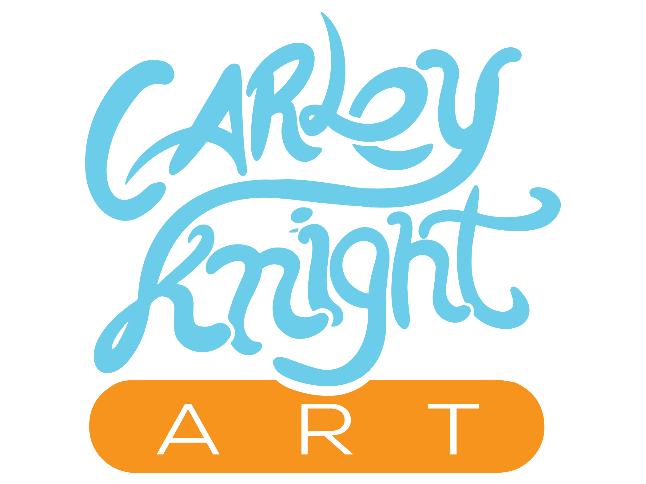
I am in the process of designing my own logo and would love some feedback. I have 3 different directions that I can go in, here they are:
Please tell me in the comments section below which one you like best and what I else I can do. Looking forward to hearing back from you.

One reply on “logo design ideas”
Hi Carley – I found my way here via the Unmistakable Creative Facebook wall. I’m also an artist/designer, so I figure us creatives got to help each other out!
I think these are good starts! 1 and 2 stand out to me as the most successful. Does the shape/amorphous line have any special significance or is referencing something? Maybe it could be pushed to look more hand drawn with some texture/distressing? I think the same thing would go with the font. Maybe try something more classical /book like. Or something very sans-serif and super modern.
Just my two cents, all the best!